Exercise 1.1 – The Instrument
Brief – Take three or four exposures of the same scene, keep the framing the same. Bring up the histogram on the preview screen to look for small variations.
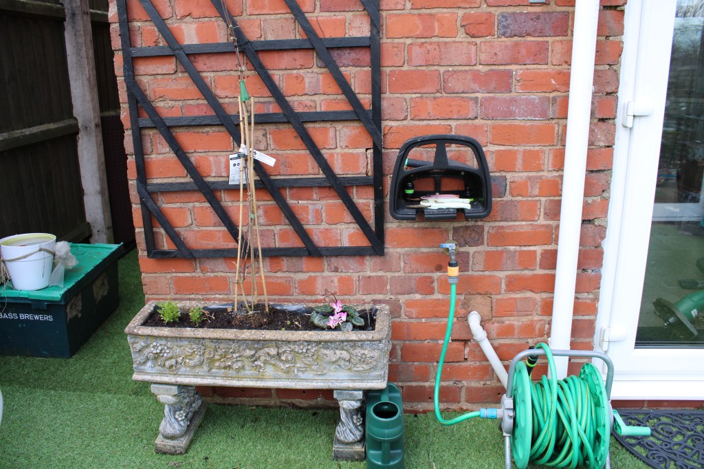
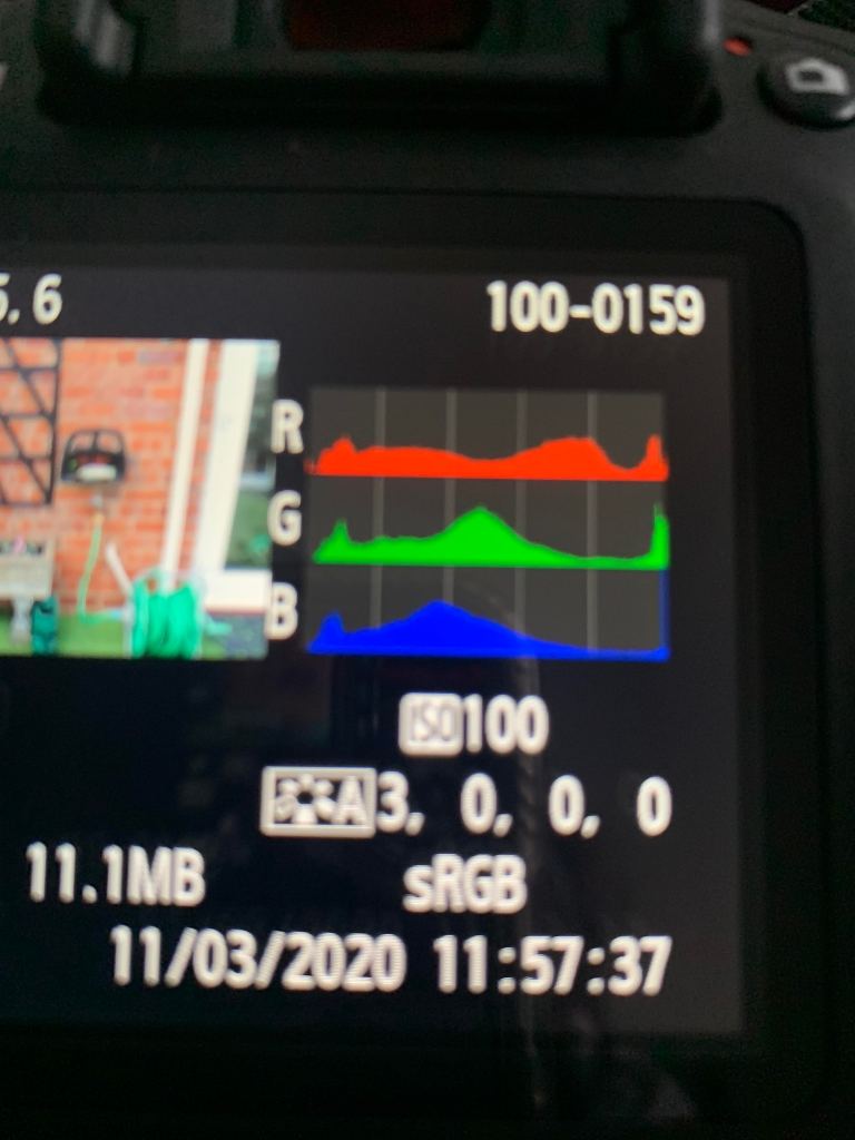
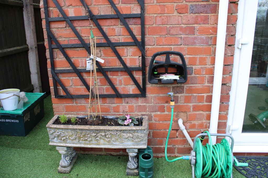
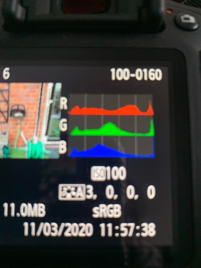
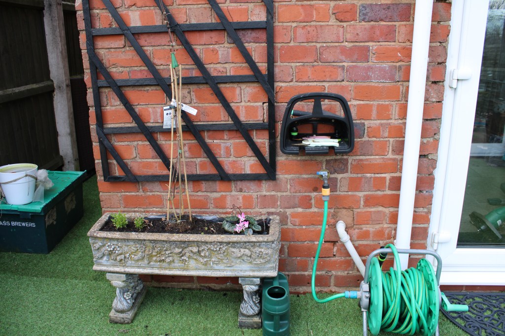
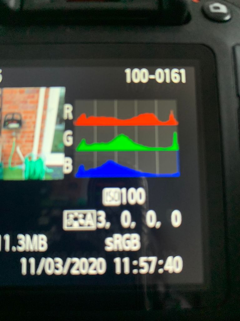
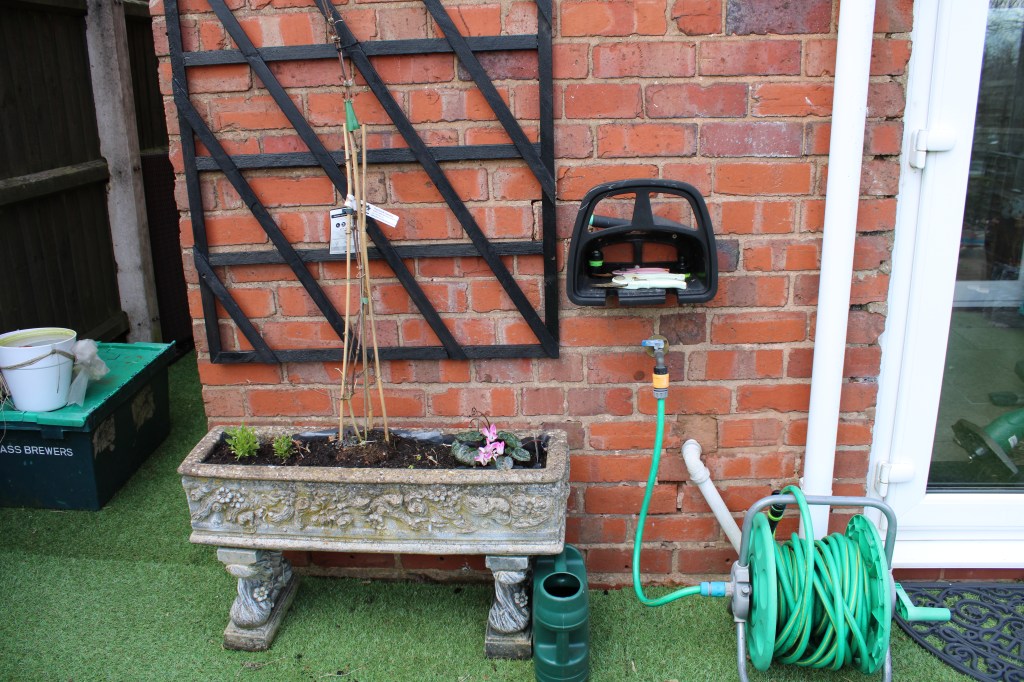
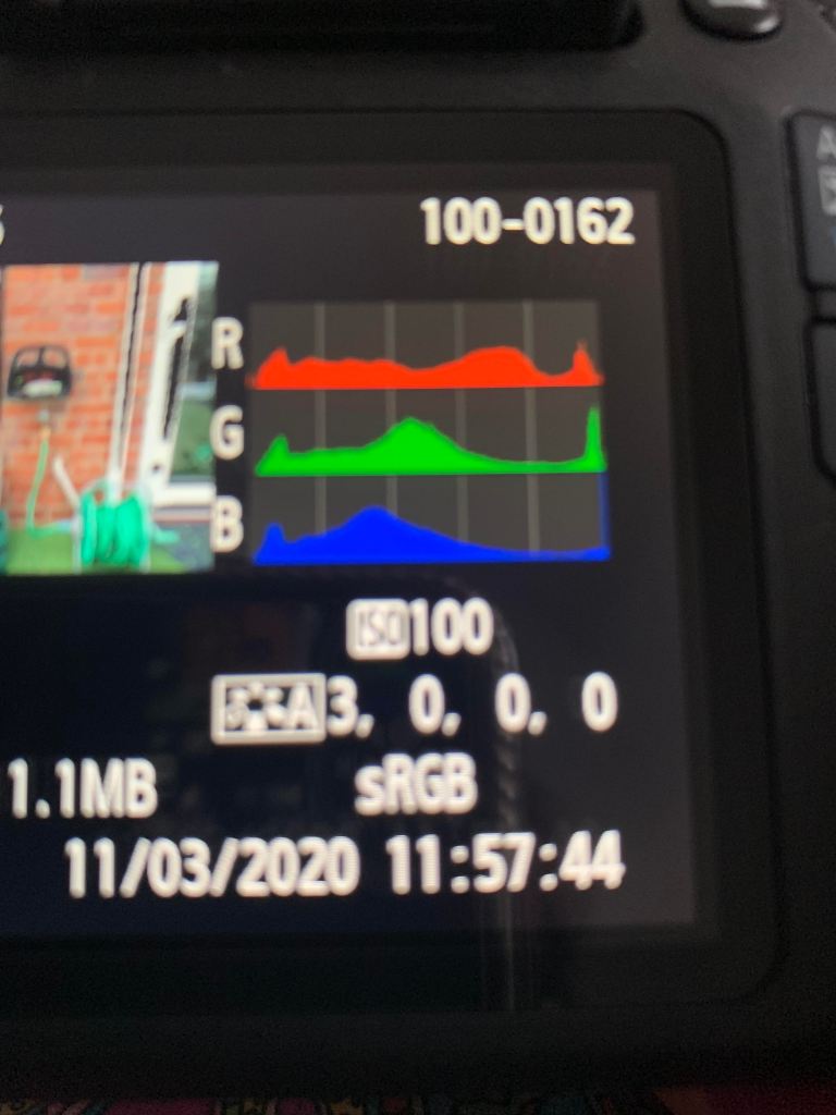
Under each image is the histogram for that picture. There are only extremely slight variations in the histograms, as they were taken seconds apart and the framing was kept the same.
For this exercise I did use the automatic setting on my camera; as the focus of the task was comparing the histograms I didn’t really compose my shots. However they were taken with an ISO of 100. The images were taken outside so the natural lighting made it easier for variations to occur, if they’d been taken indoors the lighting would’ve remained the same. However there are no major differences between the histograms.
Exercise 1.2 – Point
Brief – Take three or four photographs in which a single point is placed in different parts of the frame, whilst using the three rules.
The three rules; the place of the point shouldn’t be too obvious, the composition should hold a tension and be balanced, and the point should be easy to see.
Initial Thoughts / Research
I was quite happy when reading the brief, it seemed like a somewhat simple task, however I wanted to research a little into this exercise as one of the rules struck me with a bit of confusion – creating tension in a photograph. I Googled this subject and watched a few videos to try and get a better understanding of the concept.
Firstly I watched a YouTube video by Joshua Cripps on creating visual tension and then did a little more in depth research. There was one particular website that caught my eye and that I found really helpful. The writer and photographer, Guy Tal explained that in some way we’re competing for the attention of the viewers. He went on to state that “If an image doesn’t engage their minds in a meaningful way, they will divert their attention to something they deem more worthy”. I found this a helpful way of looking at it. So when it comes to visual tension the point is to prompt the viewers brain to spend a little extra attention trying to understand the image. They should be able to recognise there’s more in the frame than what may be obvious at first glance. I found doing a bit of initial research really helpful and eventually I came to an understanding of this concept.
References
1) Creating Visual Tension with 2 subjects : https://www.youtube.com/watch?v=v-G3Yrupg0Y
2) Create Visual Tension, Guy Tal : https://www.outdoorphotographer.com/tips-techniques/nature-landscapes/create-visual-tension/
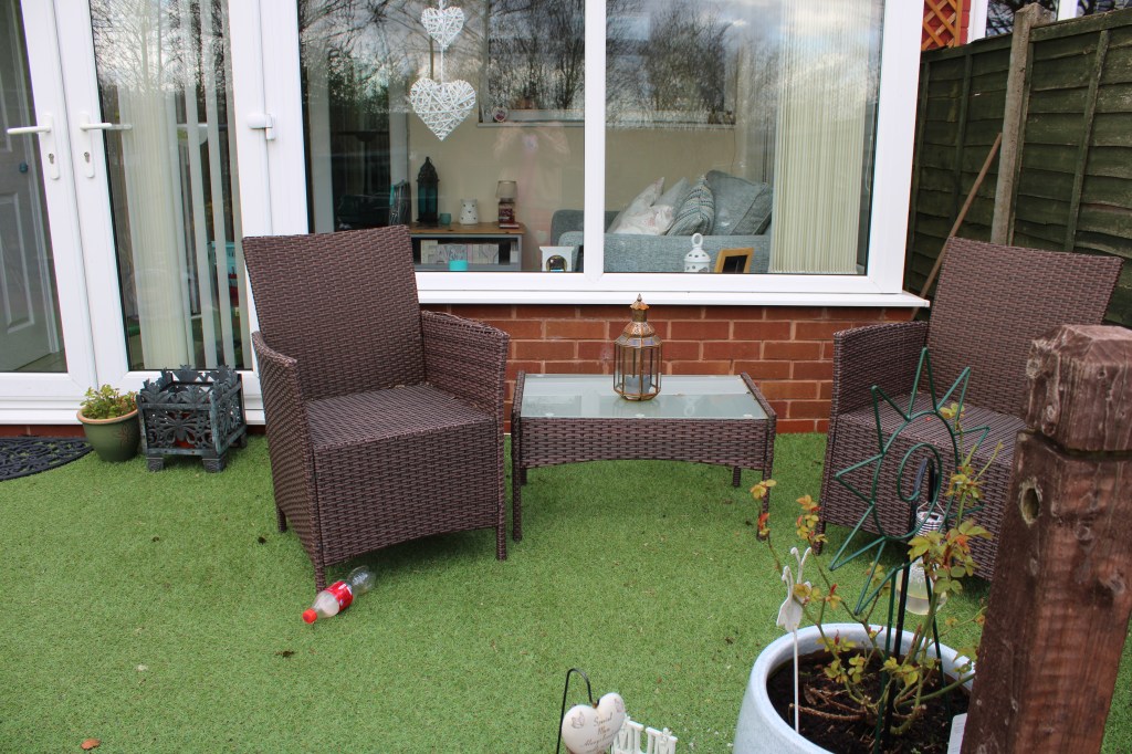
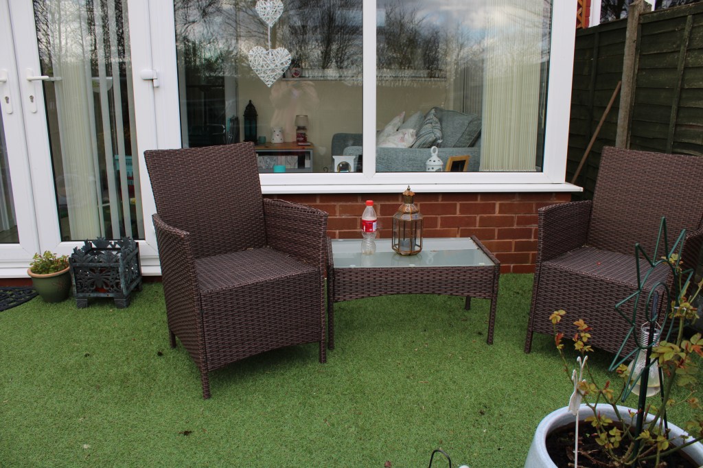
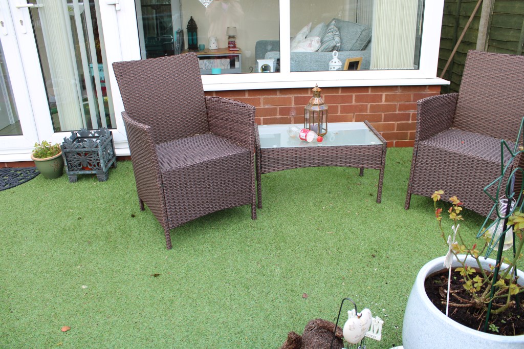
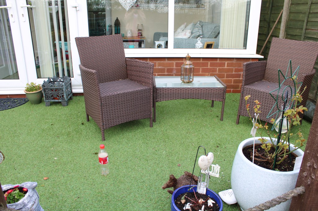
For my point I used an empty plastic bottle, placing it in different parts of the frame. This is how the shots were composed, for each image the point was moved to a different section of the frame, using the rule of thirds. I also tried to keep the framing the same for each shot, it was slightly harder as I was shooting free-hand and not on a tripod but I wanted to keep the framing of the images the same.
Whilst it’s easy to see it, I tried leaving it in places that weren’t too obvious, like under the chair and on the table. I think initially the eyes are drawn to the furniture as it’s the largest object in frame and also right in the centre. There’s also quite a bit of negative space besides the table and chairs so I think this makes it easier for the eyes to be automatically drawn to those objects. In this sense I think I kept with the rule of visual tension, initially looking at the pictures you may think the sole purpose is the garden furniture, but after looking closely you catch the empty bottle moving around the frame.
Exercise 1.3 Line
Brief – Take a number of shots using lines to create a sense of depth.
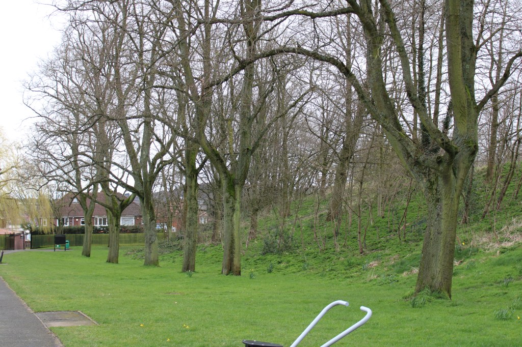
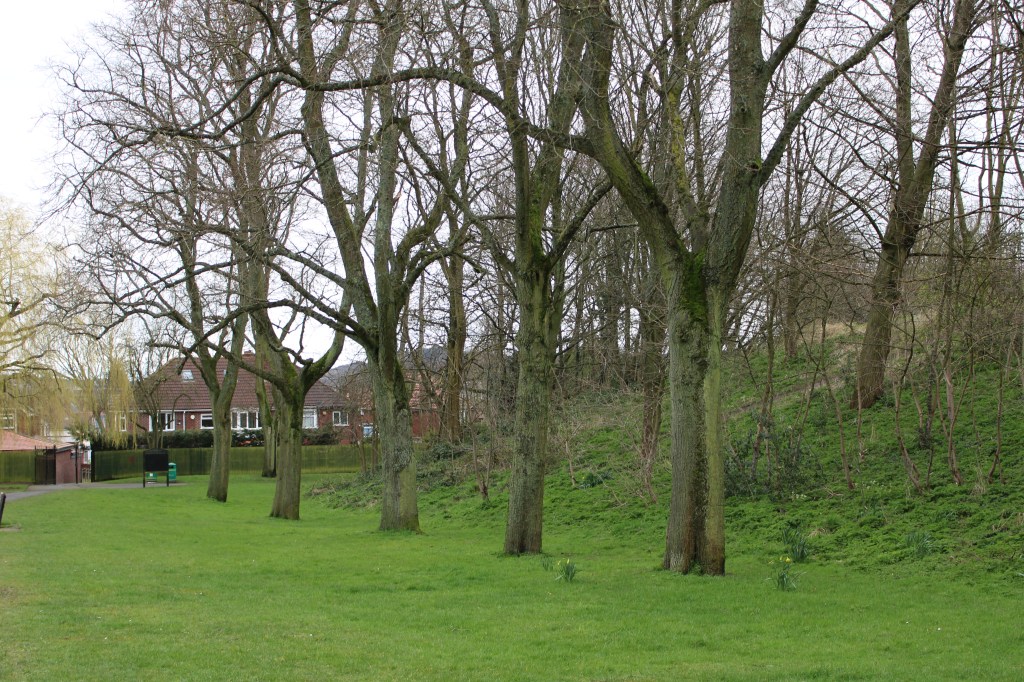
When walking through the park I noticed this symmetrical line of trees right at the entrance. I took a wide angle shot to try and create depth. The eye is drawn straight to this line of trees and follows it to the end of the picture. I think shooting a bit closer to the trees might’ve accentuated the effect but getting the full viewpoint of the trees in shot creates a taller effect. Since this shot was about depth, I used a lower aperture of f/16 to create a deeper depth of field as this was a landscape shot and I wanted the whole of the frame to be in focus.
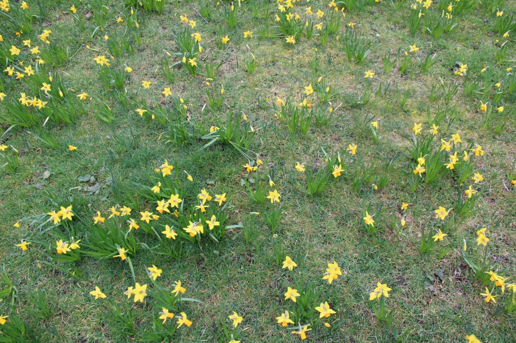
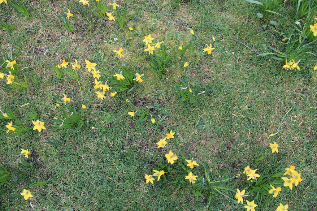
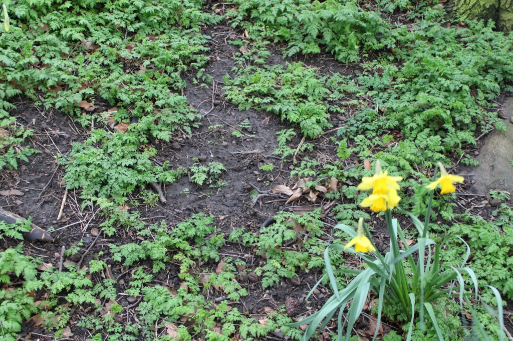
The second part of this exercise was to take some shots to flatten the pictorial space. The camera should be placed parallel to the subject. I found a large patch of daffodils and positioned the camera over it to create a flattened 2d effect.
After evaluating these two types of lines I think using the parallel technique effects the picture more as it’s easier for the eye to quickly leave the picture. With the perpendicular lines, even if the top of the picture was to be cut or cropped, it wouldn’t affect the picture as much. Which goes back to another rule of photography – leading lines should lead somewhere within the frame.
Exercise 1.4 – Frame
Brief – Take a number of shots, composing each shot within a single section of the viewfinder grid.
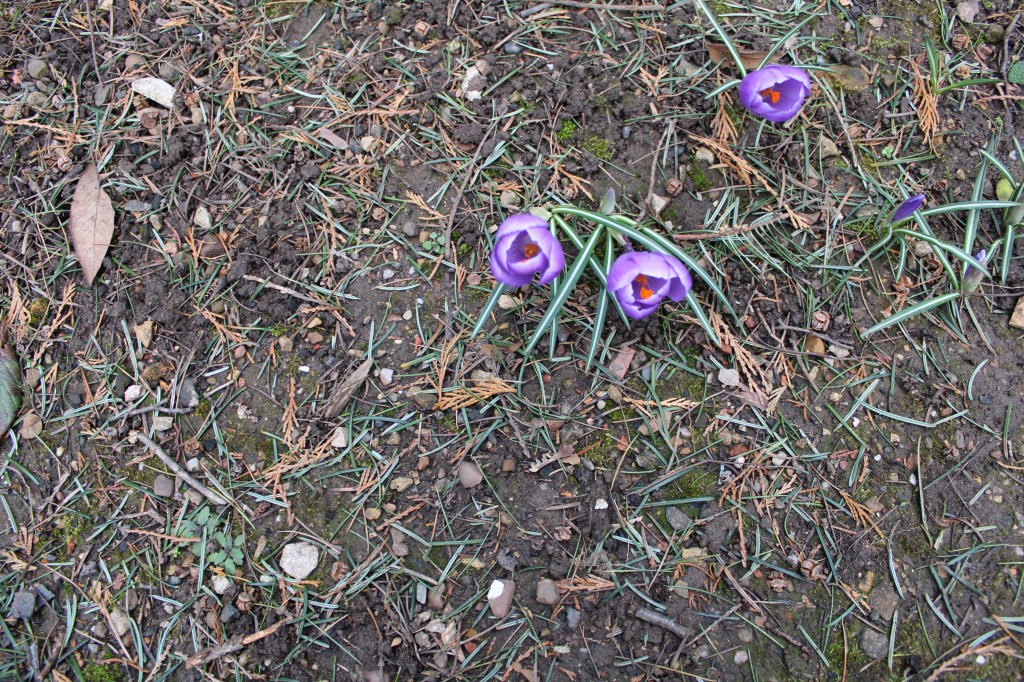
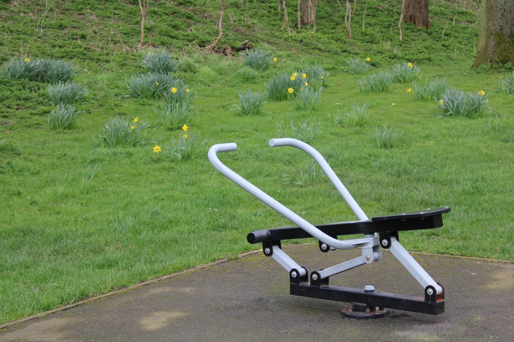
Initially reading this brief I felt confident, as composing images with the rule of thirds is something I feel somewhat comfortable with. I brought up a grid on the viewfinder screen to help me compose each section of the image. I wanted to make the sections that I composed the main focus of each image, so the eye was drawn straight to that focus point. The way I did this was by having one main focus point in each shot and trying to make use of negative space in the rest of the shot. This would make it easier for the eye to be drawn automatically to the section that had been composed. Shooting in the park made this quite an easy task, I found a lot of things in the park that I could use to compose each section of my frame. For example the use of flowers in the first shot I thought was quite impactful as they were really colourful in contrast to the negative space in the shot.
I found different focus points at random and positioned the camera so that focus point was in a certain section of the grid. I like how these images turned out because you can clearly tell which section has been composed but they still look like regular images. I think the use of negative space contrasting with colour and bold objects worked well in my favour, and because of this I believe I stuck to the brief well and portrayed it in my photography.
