Brief – Create a series of between six and ten photographs on one of the following subjects: Things, Views or Heads.
Initial thoughts
My initial thoughts on this task were that it was very open to interpretation, that you could be quite imaginative with it as the brief isn’t too strict. I didn’t want to select the easiest theme as i wanted to push myself more. The word ‘Things’ could be interpreted so many ways and you could photograph almost anything. I thought the idea of ‘heads’ was a lot less open, whilst I could take headshots, I thought there was more I could do with the other subjects. Finally, I was also really drawn to ‘Views’ as photographing landscapes is something I really enjoy. However I decided to go with ‘Things’ as there’s so much that can be done with that theme.
Research
Walter Benjamin expressed the idea that a collection should reflect a single coherent idea. There should be visual similarities so they’re easy to look at, but no duplicates as repetition is boring.
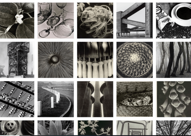
Albert Renger-Patzsch
When doing my reading I looked at Albert Renger-Patzsch, 1928 ‘Die Welt ist schön‘ (The World Is Beautiful), which was his second edition. I found it very inspiring when researching for this assignment. The original title for the collection was ‘Things’, this was Renger-Patzsch’s preferred title, however the title was chosen by the publisher. His style of photography in this sequence expressed the idea perfectly, whilst leaving room for the viewer to come to their own conclusion. He kept a black and white theme throughout which a great effect on the whole photobook as his selection of images fit together really well in a sequence but also aren’t repetitive.
My research on Albert Renger-Patzsch, 1928 ‘Die Welt ist schön‘ (The World Is Beautiful) came from :
https://www.tate.org.uk/art/artists/albert-renger-patzsch-2709
Edward Ruscha
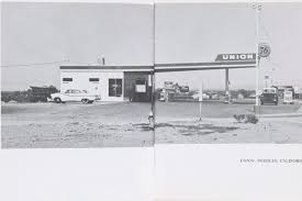
Another collection I looked at was Edward Ruscha’s Twentysix Gasoline Stations 1963, 3rd edition 1969. [Los Angeles]. Ruscha’s take on photographing ‘things’ was a modest publication consisting of black and white images of gas stations with captions. The photographs are of petrol stations, along the highway between Ruscha’s home in Los Angeles and his parent’s house in Oklahoma City.
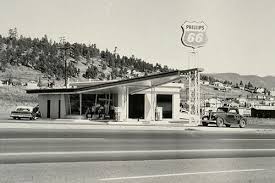
When looking at his composition he really makes use of negative space, it’s something that is seen a lot throughout this collection, which adds depth to his images. It creates the effect that the gas station is further away. In this particular image above he uses lines which almost guide the viewers eyes along the picture as they’re perpendicular to the direction of the camera.
My research on Edward Ruscha’s Twentysix Gasoline Stations 1963, 3rd edition 1969. [Los Angeles] came from:
My selection of images
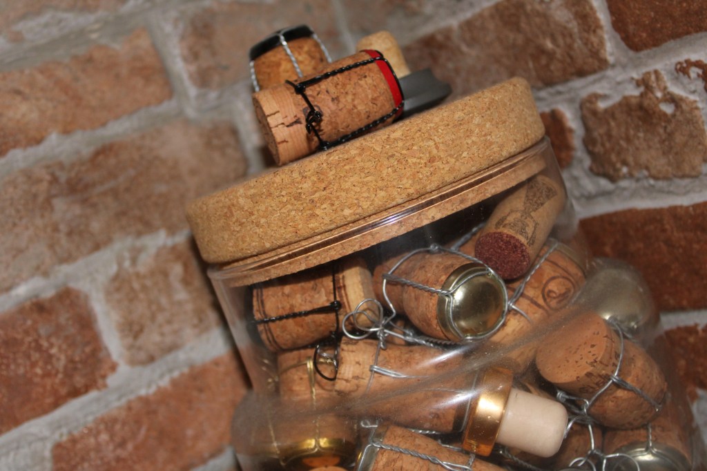
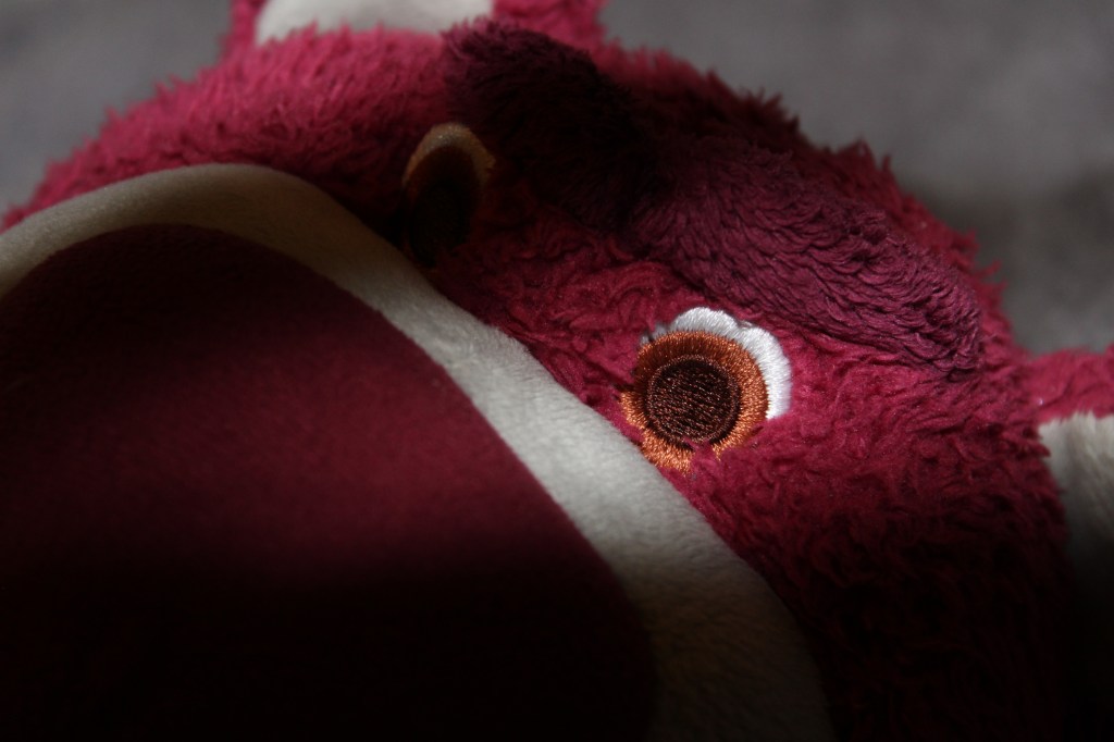
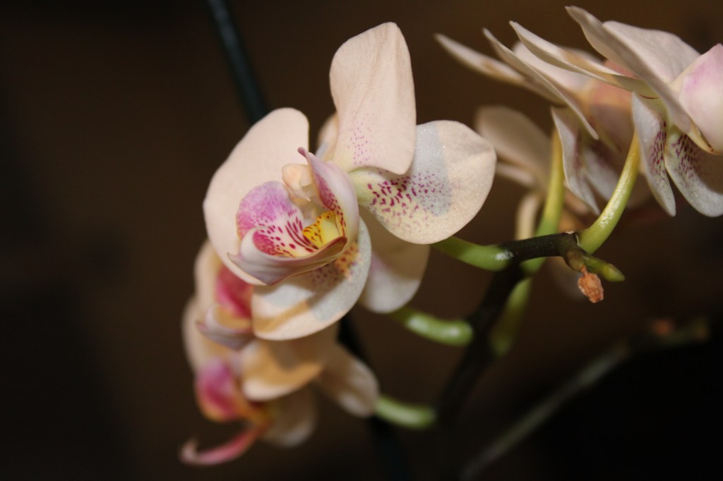
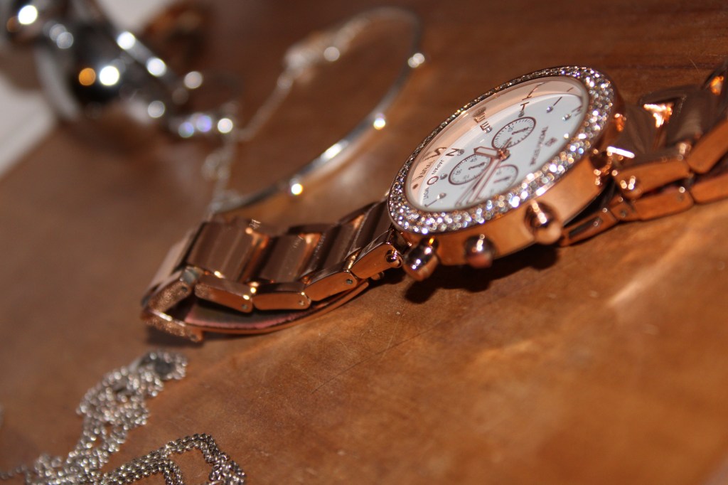
I decided to photograph normal inanimate objects, whenever I saw anything that looked inspiring or that would photograph well, I’d take a picture of it. I wanted to keep a neutral colour scheme, so they all fit together well. As well as this I wanted to capture things that you may not think to photograph when you see it, normal household objects that could make really beautiful photographs.
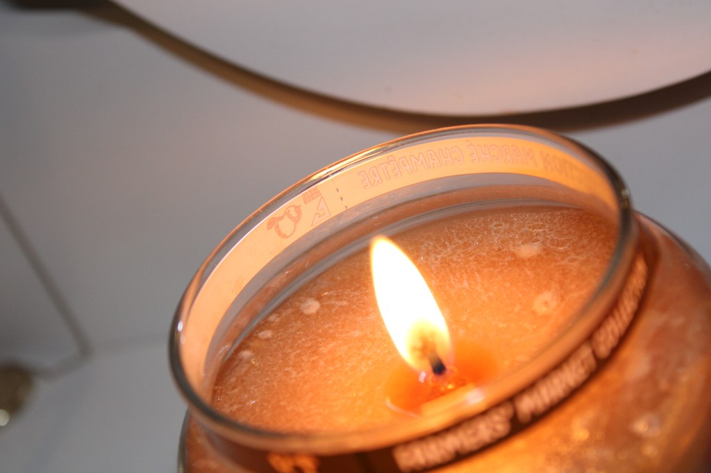
The burning flame, clear water and flower petals were my favourites as they’re elements that are some of my favourites to see pictures of. One thing I kept throughout all my pictures is zooming, together with tilting I think it made normal objects look more photographable. I used my Canon EOS 2000d and had the flash on for all pictures. I also kept the focal length at 35mm as this seemed to give the best effect. My first image was a naked flame, this was an element I really wanted to photograph as I thought it would come out quite well. I used a more sideways angle to get a different perspective as I thought it was more creative than placing the subject right in the middle of the frame, using the rule of thirds. I managed to capture the flame with quite a shallow depth of field as well as capturing the details on the wax.

The third image of the water was taken with a shutter speed of 1/60, to capture the water without it being a blur, with a zoom of 45mm. The forth image was a picture of a bear, this image is quite dark, it had a lower ISO so it wasn’t too saturated.
I then captured an image of an artificial flower in my house; I used a lower ISO so the background would come out darker. Having the flash on made the petals the main focus and where the eyes are automatically drawn too. After this is the image of the watch, whilst the strap of the watch was in focus, the sparkles on the face were a bit of a blur, as I think I should have used a higher aperture.
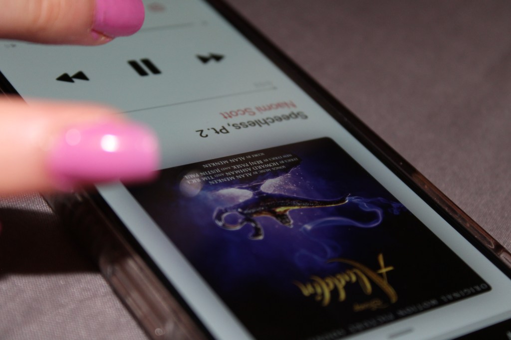
The final image didn’t really have any composition behind it, whilst my sister was scrolling through Aladdin soundtracks I saw an opportunity for a picture to be taken and took it. This was taken just on the automatic setting on my camera and the flash was still on. This picture gives off the effect that it was taken accidentally but still came out looking quite good. The blur of her finger against the crisp edge of the phone is what I liked about this image.
Reflection
After doing this assignment I’m happy with how my images turned out, I think they fit together nicely in a set and don’t show any repetition. If I was to do this again I would like to go out of my comfort zone a little more, maybe photograph somewhere more public and chose a different theme to focus on. As well as this I would focus more on the settings of the camera, making sure the aperture was right, and taking note of the ISO and shutter of each image to clarify in my learning log.
